
#04 Maps of Paintings: How it Started and How It’s Going + SXSW
Angels and Networks, Poetic Web, and much more...

In The Art Of The Process, I explore the world of process-driven creativity. Each month, I pick a project and talk about the making of, behind-the-scenes and the creative process.
I never thought I could be inspired by making a digital experience from a book, but here we are.
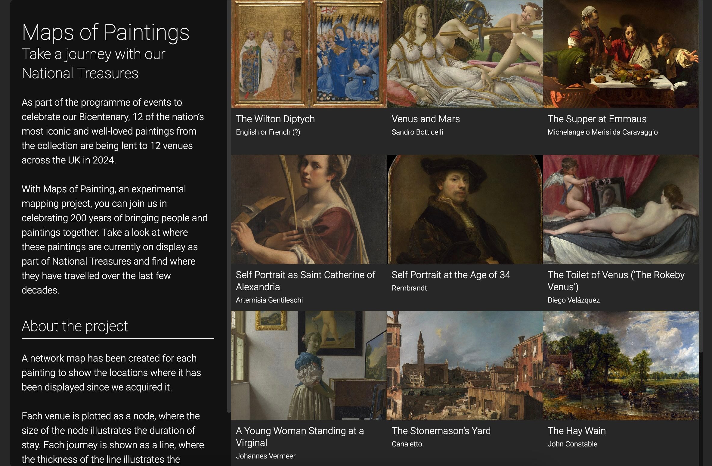
I was commissioned by the National Gallery in London to create an experimental mapping project to discover how some of the Gallery’s paintings have moved through time. I called it “Maps of Paintings”.
But first…
🎤 Let’s take “The Art of The Process” to SXSW—together! I’ve applied to speak at SXSW 2025 in London but here’s the catch: I need your vote to make it happen. My talk, "The Art of Process: Redefining Creativity in the AI Age," is a love letter to process, a call to rethink how we value creativity—not just the shiny outcomes but the journey that gets us there.
Vote here and search for "The Art of Process". Thank you!
Maps of Paintings: How It Started
I’ve studied art but I don’t come from a family of artists. Quite the opposite. So I guess how my career started was a classic case of serendipity.
But where did Maps of Paintings start? From the data? From a moodboard? The truth is that I struggled to find any kind of inspiration for this project, to the point that I was questioning if I could ever meet the deadline. Can you relate?
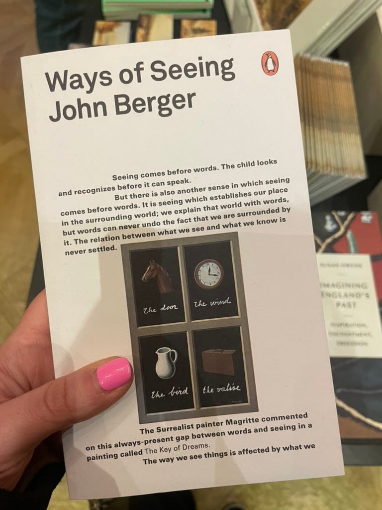
Then one day, I was visiting The Wallace Collection in London and I had a look at the bookstore. My eyes stopped on a book. I love unusual books. I’m familiar with the work of John Berger because I watched his BBC show on YouTube a while ago. I bought the book immediately and devoured it in two days.
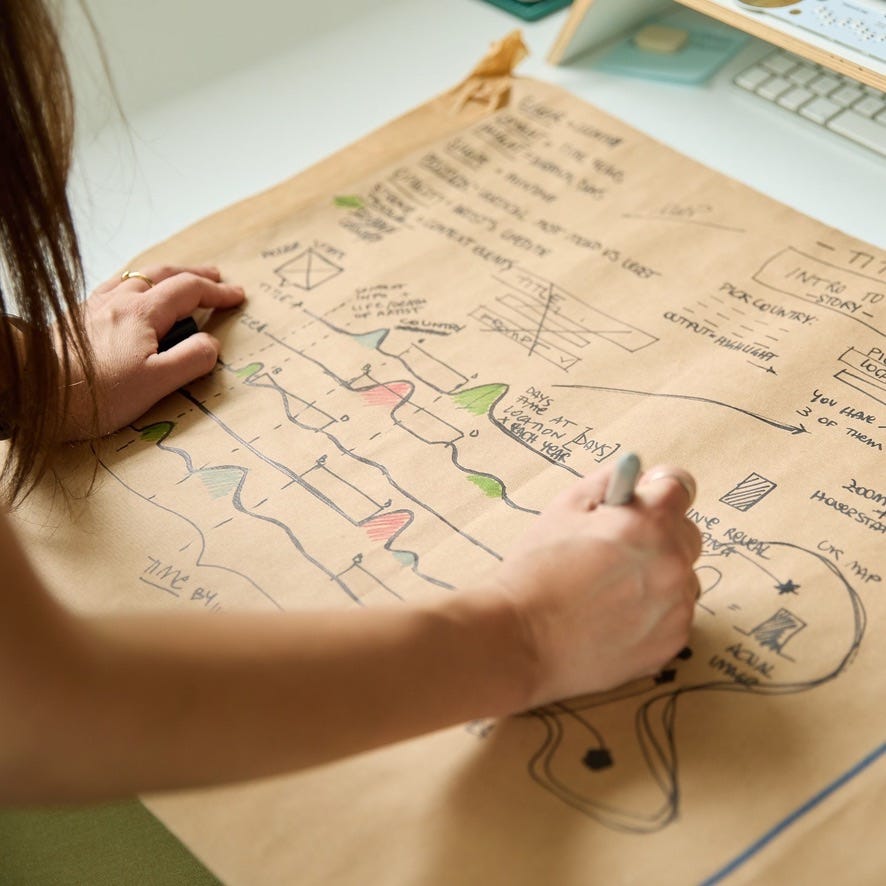
The following day I went back to the studio and started sketching like nobody was watching. Finally, ideas started to flow and take shape. I sketched out three versions before landing on the final one. Now I can say that Maps of Paintings started from a serendipitous moment.

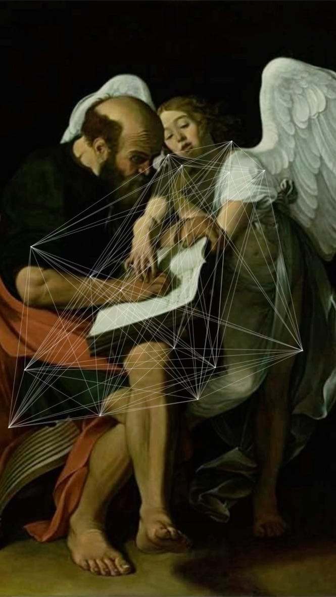
I'm fascinated by the unexpected shapes generated by the data. There's so much to know about a painting beyond its technique and subject. The movements, for example. Paintings, like people, move. I wanted to visualise these movements, displaying them as arcs of narratives because each journey is a story. I started working to visualise the journey as networks. After a bit of trial and error in Processing the first iteration was this. I called “Angels and Networks: Poetic Web”. Here’s the animated version.
But let’s talk more about the book, the real core of the process.
The Impact of Reproduction on Art's Meaning
I’m not referring to AI here. John Berger's Ways of Seeing is a foundational text in art criticism and cultural theory, focusing on the ways we perceive and interpret visual images. A highly recommended reading.

Berger explores how technological advancements, especially photography, have changed the role and meaning of art. When art is reproduced, it loses its "aura"—a term borrowed from Walter Benjamin—because it is detached from its original context. For example, a painting originally intended for a cathedral becomes something entirely different when viewed on a phone or printed in a book. This concept resonated with the work I was doing as my subjects were 12 iconic paintings from the National Gallery displayed on a screen.
Reproduction democratises art, making it accessible to a wider audience. It allows it to be re-contextualised for various purposes.
“In the age of pictorial reproduction, the meaning of paintings is no longer attached to them; their meaning becomes transmittable. It comes to mean something different, or to mean many different things.”—John Berger
Inspired by Berger's words, I wanted to create an experience with multiple layers of meaning. Two key actors became central to the story, focusing on how we make paintings and their information accessible to people.
First, you: the viewer. In Maps of Paintings, you can search for any location, putting yourself at the centre of the story, rather than the other way around.
Second, the relationship between a painting, which is silent and still (more on this below), and the dynamic journeys it has undertaken. Because paintings, like people, move.
What I like most about Maps of Paintings is that it isn't about the past at all. It's about the present—an archive viewed through your lens, with your experiences and stories in the foreground.
The Paradox of Reproduction
I’ll try to not make this sound like a lecture. The paradox of reproduction enables broader engagement with art but also strips it of its historical and spatial integrity. This transformation makes the act of viewing art an active negotiation between the original intent and the new context of its display, asking viewers to question what is gained and lost in this process. A concept also studied by Walter Benjamin in ‘The Work of Art in the Age of Mechanical Reproduction’ (another great book!). Technological advancements, particularly in the realm of mechanical reproduction (hello photography, Internet, and now AI), have changed the reception and purpose of art in modern times. A sentence from Berger’s book that spoke directly to me and my practice was:
“Original paintings are silent and still in a sense that information never is.”
—John Berger
Berger points out something special about original paintings—you can actually see and touch them, which makes them feel alive and relevant no matter when they were created. I wanted to recreate this physical connection but in a digital, synthetic environment.
Making Visible the Invisible
As I like to visualise what cannot be seen—data linked to invisible phenomena—for me, Maps of Paintings reveals the invisible. It shows ways of seeing a painting that we had never imagined before. It focuses on accessibility and on how it makes paintings, and information about them, accessible to you.

How It’s Going
Once I knew what to do, it took just a couple of weeks to design the entire experience. I generated a map for each painting to show where it has been displayed over time. Each location appears as a dot on the map—bigger dots mean the painting stayed there longer. Lines connect these locations to show the painting's journey, with thicker lines showing more recent travels.
Maps of Paintings perfectly illustrate what I mean when I say my creative process consists of 80% research and only 20% of production.
Here you can read my full interview with The National Gallery (you need to scroll down a bit…).
Here you can try Maps of Paintings—which works on mobile too.
Here you can look at the behind-the-scenes photo gallery.
More content will be shared on my Instagram page.
A massive thanks to The National Gallery team for this wonderful journey! :)
I'd love to keep the conversation going, so please share this article with your community or leave a comment!
What other project process do you want to read about? You can pick your favourite from here and leave a comment below.
Well done on making it here!
Till the next one.
T.